Foundations II: Core Concepts
This project was a set of Exquisite Corpse panels, each designed by a different student, painted to have continuity with each other when placed together. We were given red, blue, yellow, orange, black, and white acrylic paint and a masonite board to start with. I first painting an orange wash for the under painting, then I added a yellow wash after.I carefully chose the areas that I wanted to have the most value and opacity. I used the RYB primaries to create the oranges, reds, blues, and purples that I used in the final piece. The cyan color I used in the final layer appeared much more saturated than my other colors, although the yellow was a close second. I didn't create any tints, but I did create a darker shade of blue behind the cyan rectangle. The composition has unity because of the similar shapes and variety in their colors. The proportion of the rectangles also create variety: one is large, one is small, and two are long and skinny.
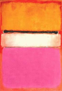
I appropriated Mark Rothko's abstract expressionism painting style for my panel. Mark Rothko is known for his luminescent rectangles ("multiforms") that appear to be floating on top of a stained ground. Different colors are layered on top of each other so that the previous layers show through. Rothko used vibrant complementary colors until later in life when he switched to desaturated blues and grays and more frequently used analogous color schemes. My first layer of colors was far too opaque, which makes the edges and corners of my multiforms appear less diffused than his.
0 Comments
Leave a Reply. |
AuthorI am a student at Siena Heights University. Learning Outcomes & Concentrations
All
|
 RSS Feed
